
Solar Thermal Fault Diagnosis: Why Shape Matters More Than Temperature
Almost every solar thermographic report you will ever be shown leads with hot spots. Bright marks on a dark array, a temperature figure beside each one, a severity label. It looks like a finding. Very often it is not.
A hot spot is a symptom. It is not a diagnosis. The same temperature rise, on the same array, on the same afternoon, can be produced by at least four entirely different faults. One of them is a safety matter. One costs you a measurable slice of annual yield. One is recoverable if it is caught early enough and permanent if it is not. And one is not a fault at all, but the module working exactly as designed.
Reported as a number alone, all four look the same. They attract the same severity band, the same red marker, and frequently the same recommendation, which is usually some version of investigate further. That is how an owner ends up paying to send someone onto a roof to look at a junction box that was never faulty.
What separates them is not how hot the anomaly is. It is what shape it is, where it sits, and whether it repeats. This piece is about reading that.
Blog Content TL;DR...
Why the temperature figure on a solar thermal report is only half the answer.
- A hot spot is a symptom, not a diagnosis. The same temperature rise can come from four different faults with four different costs.
- IEC 62446-3 severity is measured against healthy modules in the same conditions, not against ambient air, and it sets the band rather than the cause.
- Symmetrical patterns mean electrical conditions at module or system level. A tidy shape is a circuit doing something.
- Asymmetrical patterns mean localised cell or component damage. Cracks, shunts and debris are irregular and do not repeat.
- Warm junction boxes in consistent positions across many modules are normal, and reporting them as faults sends people onto roofs for nothing.
The first question on a thermogram is not how hot it is. It is what shape it is, and whether it repeats.
What the Number Does and Does Not Tell You
Severity is measured. Cause is diagnosed. They are not the same job

What the temperature figure actually tells you
Under IEC 62446-3, the temperature difference between an anomaly and its local reference sets the severity band. That reference is not the ambient air. It is the working temperature of comparable healthy modules in the same conditions, so a panel at 55°C on a hot afternoon may be entirely normal while the same reading in March would not be.
The bands run from advisory, at one to four degrees above the reference, through to critical above twenty. A cell-level anomaly beyond forty degrees is a mandatory safety trigger regardless of anything else. Findings below four degrees are recorded as observations rather than classified anomalies, but they are recorded, because an early-stage fault is worth knowing about before it becomes an expensive one.
Severity is not cause
Here is the part that gets skipped. The band tells you how big the thermal event is. It tells you nothing at all about what is producing it.
A twelve degree rise above reference could be a single cell shunting, a bypass diode conducting across a third of the module, an early potential induced degradation gradient, or a connector degrading in the string. Same number, same band, four different faults, four different costs and four different things to do about them.
Which is why Drone Media Imaging assigns two things to every classified anomaly: the IEC severity band, and separately a consequence classification of safety, yield or degradation trajectory. The first is measured. The second is judged, and it is the one that tells an owner whether to act this week or at the next service visit.
what does a solar panel hotspot mean, bypass diode thermal signature, IEC 62446-3 severity bands explainedwhat does a solar panel hotspot mean, bypass diode thermal signature, IEC 62446-3 severity bands explained
Symmetry, and What It Gives Away
The rule that does most of the work
There is one distinction that separates most solar thermal faults before any temperature is considered at all.
Symmetrical patterns point to electrical conditions at system or module level. Asymmetrical patterns point to localised defects in the cells or components.
It sounds almost too simple to be worth stating. In practice it is the single most useful discriminator in the discipline, because the two families have completely different causes, different urgencies and different people who need to fix them.
Why symmetry means electrical
A module or a string is a series circuit. When something interrupts or bypasses part of that circuit, the affected section heats evenly, because the same current is being dissipated across the whole of it. That produces clean geometry: a whole module uniformly warm, a whole string uniformly warm, a neat rectangle covering exactly a third or a half of a module.
Cell-level damage has no such discipline. A microcrack follows the fracture. A shunt sits where the manufacturing defect is. Debris sits where it landed. The result is irregular, and it does not repeat across neighbouring modules, because nothing systematic caused it.
So the first question on any thermogram is not how hot. It is whether the shape is tidy, and whether the same shape appears somewhere else on the array. A repeating pattern across many modules on the same inverter input is telling you about the inverter, not about the modules, and no amount of module-level investigation will find it.
Reading Five Common Patterns
Four readings, and what each one means
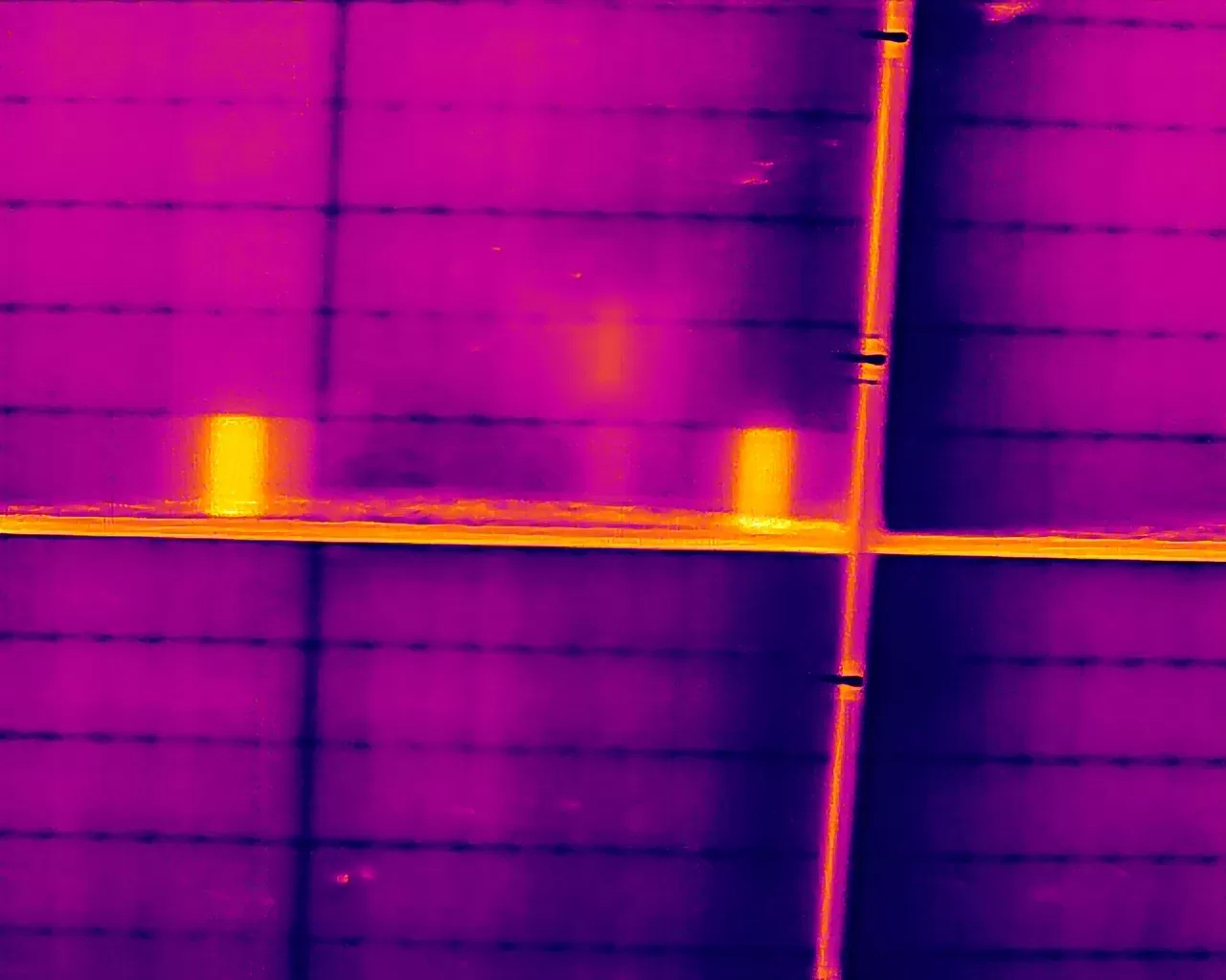
A neat rectangle covering a third or a half of a module. That is a bypass diode conducting. It may be doing its job, protecting shaded cells, or it may have failed short and be conducting permanently. The distinction matters, because one is the system working and the other is a module producing a fraction of its rated output and heating a junction box while it does so.
A gradient across a module with the cells nearest the frame warmest and the centre coolest. That is the signature of potential induced degradation, driven by system voltage between the cells and the grounded frame. Caught early it is substantially recoverable through reverse-bias treatment. Left until the encapsulant has chemically altered, it is not.
A single cell hot, in a linear, diagonal or star-shaped mark. That is a microcrack disrupting the metallisation on the cell. A rounded, amorphous single-cell mark in the same position means something different, a shunt rather than a fracture, and it behaves differently over time.
A whole string uniformly elevated. Nothing is wrong with those modules. Something upstream has disconnected them, and the fault is in the wiring, a connector or the inverter, not in the panels being photographed.
The one that is not a fault at all
Junction boxes run warm. That is normal. When the warm junction boxes appear in consistent positions across many modules, that is a module design characteristic and not a finding.
An isolated junction box hot on one module while its neighbours are cool is a genuine connector or internal diode issue. The difference between those two readings is whether anyone gets sent onto the roof, and it is decided entirely by whether the pattern repeats.
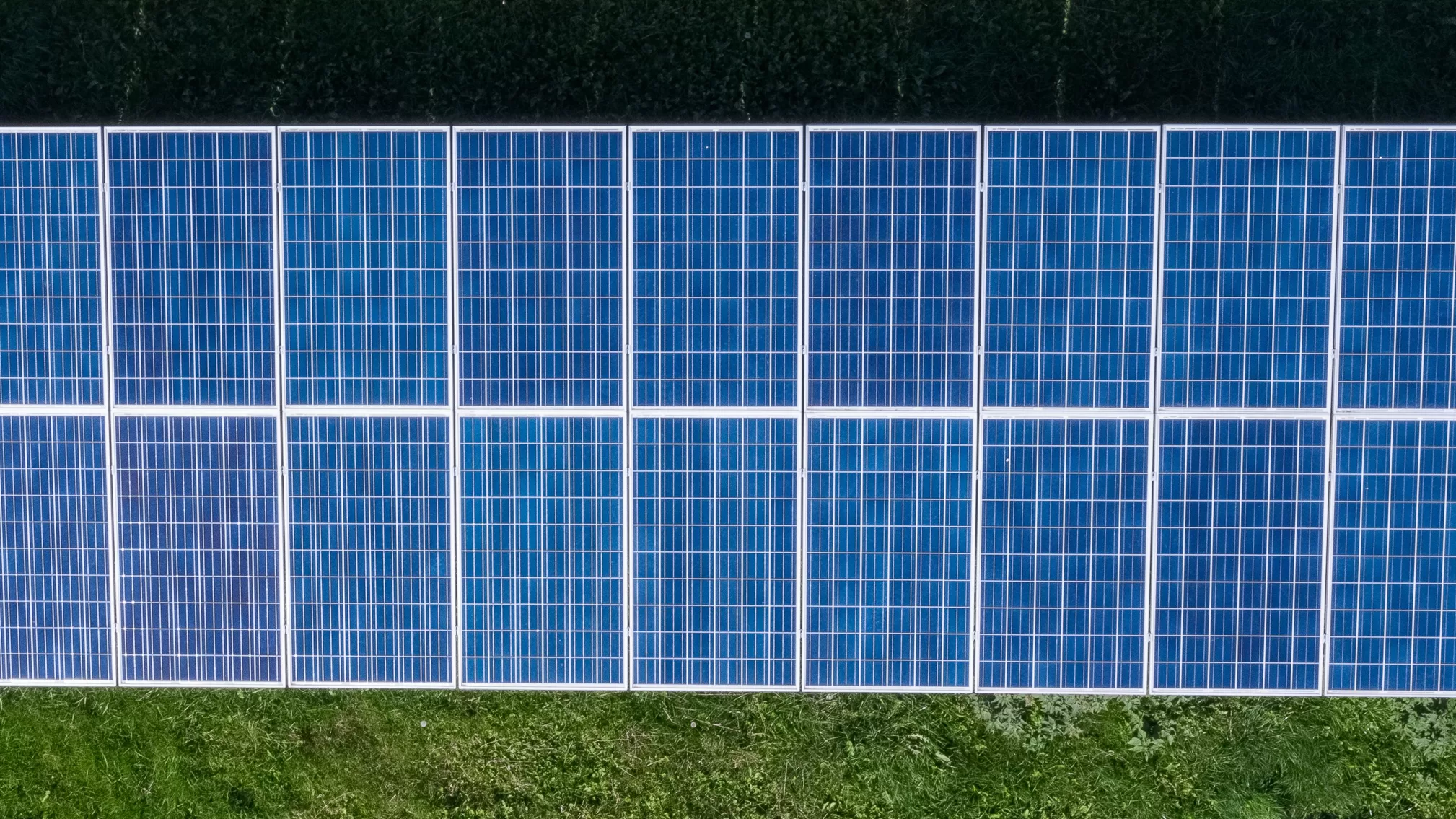
The reference. Severity is measured against the working temperature of comparable healthy modules in the same conditions, not against ambient air. Get the reference wrong and every band on the report is wrong with it.
The bands. One to four degrees above reference is advisory, a monitoring observation below the classification threshold. Four to ten is low to medium. Ten to twenty is medium to high. Above twenty is high or critical and warrants immediate investigation. A cell-level anomaly above forty degrees is a mandatory safety trigger.
The threshold. Findings at four degrees above reference and beyond are classified anomalies. Below that they are recorded as observations with a reassessment recommendation, rather than dropped.
Two axes, not one. The IEC band measures the thermal event. The consequence classification, safety, yield or degradation trajectory, states what it means for the asset. A medium band finding can carry a safety consequence where an absolute temperature trigger is met, and the two are assigned independently for every classified anomaly.
Governing Standards
- IEC 62446-3:2017 specifies the thermographic method for photovoltaic systems, including the outdoor infrared inspection procedure and the anomaly classification framework referred to throughout this article.
- The Drone Media Imaging Consequence Classification runs alongside the IEC severity band, expressing what a finding means for the asset as safety, yield or degradation trajectory. Both are assigned to every classified anomaly.
- This is qualitative detection. Thermography identifies where a module or string is behaving abnormally. It does not measure electrical performance, and confirming a suspected electrical fault requires string-level testing under IEC 62446-1.
- Findings are reported as observations warranting further investigation by a suitably qualified contractor. Drone Media Imaging carries out no remedial or corrective work of any kind.
- Survey, analysis and reporting are conducted by Steve Fisher, ITC Level III Certified Master Thermographer (Infrared Training Centre; Certification #205722059), practising in accordance with the frameworks of ISO 18436-7:2014, ASNT SNT-TC-1A and ANSI/ASNT CP-105, and BINDT CMGEN Appendix B as UK training governance.
Get a Second Reading on Your Last Report
If you have an inspection report full of hot spots and no clear account of what is causing them, that is worth a conversation. Tell us the array size, roughly when it was last inspected, and what the report recommended.
We also analyse and report on imagery captured by others. Where a Level 1 operator has flown the array, the thermograms can be reviewed and classified to Level 3 standard without anyone returning to site.
related posts
Thermal Fire Monitoring Following a Grain Store Terminal Explosion
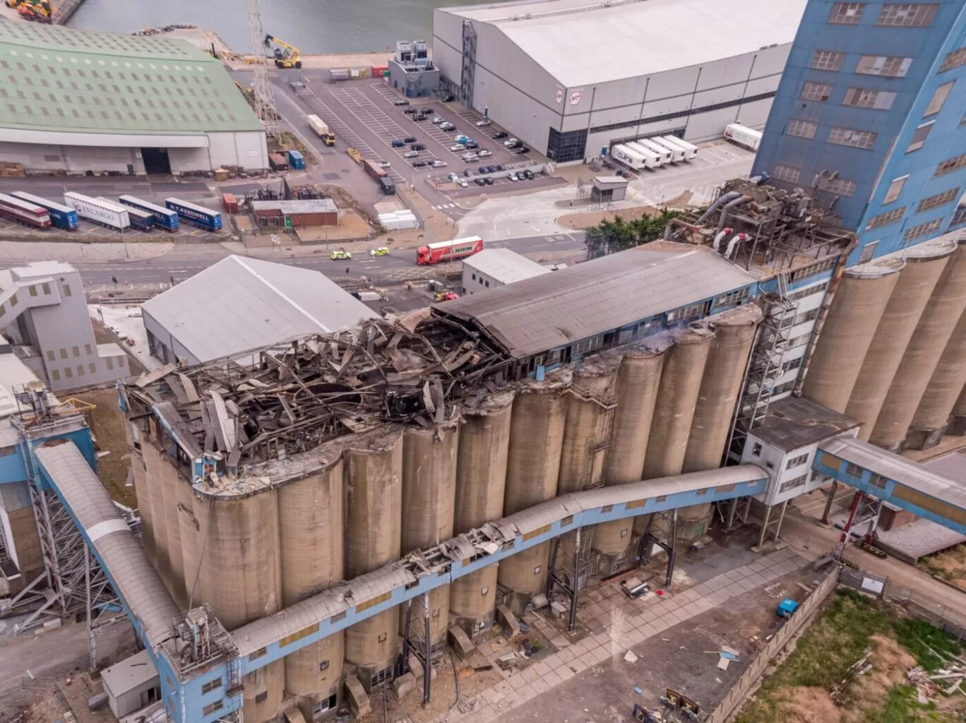
Grain Store Explosion and Year-Long Fire – July 5, 2020 – Tilbury Port, London On July 5, 2020, a series of events (possibly by a spark) triggered a large dust explosion and a subsequent fire at the Grain Store Terminal at the Port of Tilbury in London. This was a serious event that required the attention of a large-scale emergency response to get the subsequent grain fire under control and avoid additional explosions. No one was seriously hurt, which is nothing short of a miracle given the number of people on the scene and the amount of reinforced concrete and debris thrown high into the sky before raining down on the surrounding buildings.
Traditional firefighting methods and techniques are ineffective in the case of grain storage fires. Using water to extinguish the inferno is ineffective with grain and dust fires, and the added weight might have caused a catastrophic structural collapse, exacerbating an already challenging situation. As a result, London fire teams were on the scene for days while a proper fire strategy and plan was developed and implemented, with staff always remaining on-site to monitor the situation over the following weeks.
Throughout this early period, there was always the possibility of more explosions and the fire spreading since the grain stored in the linked silos generates dust that may ignite if the temperature is high enough. Drone Media Imaging was contracted to fly thermal imaging flights to collect temperature data to estimate fire spread and track fire management efforts over time. For instance, were the temperatures rising, falling, or remaining constant?
We began operations on July 7, 2020, flying three flights each day, seven days a week initially, to compare temperatures and report back to crisis management teams and emergency service gold commanders. We eventually completed our thermal imaging missions one year and a month after the initial Grain Store explosion in late August 2021! While not all of the silos were full with grain, many were, and several were burning at temperatures far beyond 800°C. Before the fire could be quenched, the building had to be entirely demolished. Temperatures more than 80°C were still being recorded in the grain that remained on the ground after demolition 13 months later.
Gaining safe access to the terminal to fly was not without difficulty, as emergency services had imposed a 50m exclusion zone surrounding the terminal due to the possibility of additional explosions. As a result, our risk assessments and method statements had to be developed specifically for this circumstance and rigorously tested to assure both safe drone flights and the most accurate thermal data gathering at this vital juncture.
We continued to provide the Port of Tilbury London and the accompanying emergency services with daily and weekly calibrated temperature measurements that documented the progress of the grain store fire over 13 months. As thermal infrared aerial specialists, we provided data in the form of detailed reports, thermal imaging, RGB photographic and video footage.
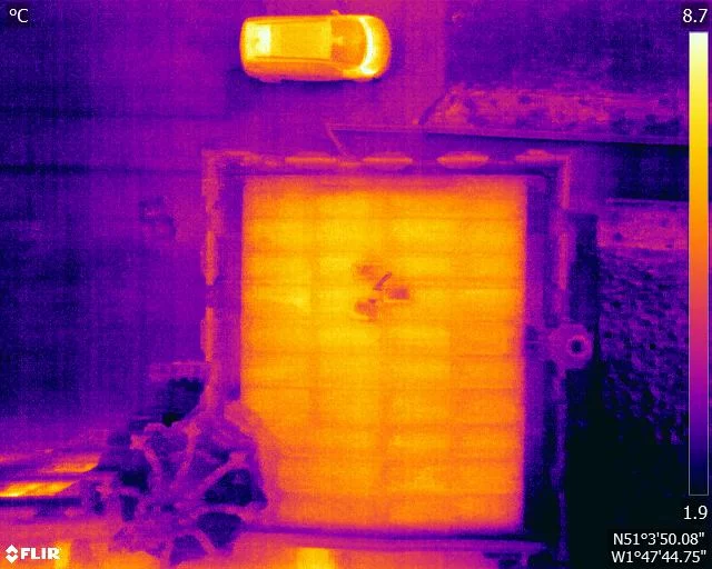
A flat roof is a build-up of layers, and water in the insulation changes how that part of the roof stores and releases heat. It does not make water visible to a thermal camera. What it creates is a lag, a wet zone that cools more slowly than the dry roof around it once the sun has gone. This is how that lag is produced, why the survey is timed to it, and what a warm patch is honestly worth.
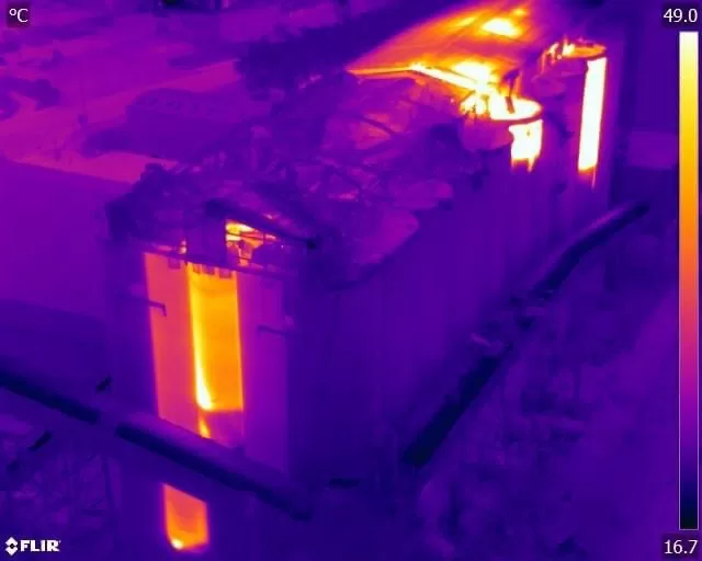
Quantitative thermography measures corrected surface temperatures and produces defensible numbers. Qualitative thermography identifies faults from thermal pattern and contrast without assigning values. Neither is the easy option, and most professional surveys use both: a qualitative sweep to find the anomalies, then quantitative measurement to classify the ones that matter. The distinction that counts commercially is not the method but who interprets the data, and what they are qualified to conclude. Drone Media Imaging analyses at ITC Level III.