
What a Solar Panel Thermal Image Is Actually Showing You
A thermal image of a solar array is easy to produce and easy to misread. The camera records surface temperature, and surface temperature is a symptom rather than a diagnosis. Two modules can sit at the same peak temperature and carry entirely different faults, with entirely different consequences for the asset owner, because what separates them is not how hot the anomaly is but what shape it takes and how far across the module it runs.
That is the genuinely difficult part of a solar survey, and it is the part that rarely appears in the marketing. Classifying an anomaly means reading the pattern first, establishing the baseline it is measured against, excluding the environmental explanations, and only then attaching a severity to it. Get that order wrong and a reflection becomes a defect, a normal junction box becomes a fault, and the client receives a report full of confident imagery that means very little.
What follows is how thermal signatures are actually read on an operating photovoltaic array. What a single hot cell suggests, why a uniformly warm third of a module points somewhere completely different, how potential-induced degradation gives itself away by geometry, and which convincing warm patches are not faults at all. It closes on why severity is framed with caution rather than asserted, which matters more than any single temperature figure on the page.
Blog Content TL;DR...
A thermal anomaly on a solar module is a symptom, not a diagnosis. Here is how the signatures are actually read.
- Every classification is measured against a baseline taken from a clean, normally operating module in the same frame, never against an absolute temperature.
- The shape and the scale of the warm area identify the mechanism. Symmetrical patterns point to electrical conditions, asymmetrical patterns to a defect in one cell or one component.
- A single warm cell, a uniformly warm third of a module and a frame-edge gradient are three different faults with three different consequences.
- Soiling, shading, specular reflection and normal junction box signatures imitate faults convincingly, and are excluded before classification rather than after it.
- Severity is banded against the baseline under IEC 62446-3:2017, classified conservatively near a boundary, and reported alongside the pattern rather than as a single figure.
Read the pattern, establish the baseline, exclude the impostors, then attach a severity. In that order.
Pattern First, Temperature Second
How a thermal anomaly is approached before any figure is attached to it
A symptom, not a diagnosis
Every classification starts from a baseline, the temperature of a clean, normally operating module in the same frame under the same conditions. An anomaly is a departure from that baseline rather than from an absolute figure, because the baseline itself climbs through the day as irradiance and ambient temperature rise. The same absolute reading can be unremarkable in mid-afternoon and significant first thing in the morning, so a temperature quoted without its reference is not evidence of anything at all.
Once the baseline is established, the useful question is not how large the difference is but what shape the warm area takes. Heat is being produced somewhere by something, and the geometry of the warm region is a direct clue to the mechanism producing it.
Scale tells you where to look
Anomalies operate at five scales, and identifying the right one removes most of the wrong answers immediately. A single cell, roughly a third of a module, a whole module, a whole string, or a whole section of the array. A warm patch confined inside one cell boundary cannot be an inverter condition. A string running uniformly warm along its whole length cannot be a cracked cell. Reading the scale correctly is the difference between pointing an owner towards a module and pointing them towards an electrical investigation much further upstream.
Symmetry narrows it further
The second instinct is symmetry. Even, repeating, symmetrical patterns tend to indicate electrical conditions at module or system level, where something has stopped extracting the energy the cells are still producing and that energy has nowhere to go but into heat. Irregular, localised, asymmetrical patterns tend to indicate a defect in one cell or one component. That single distinction, applied before any temperature is quoted, resolves a large share of what a survey turns up.
how to read a solar panel thermal image, what a hot spot on a solar panel means, bypass diode fault on a thermal imagehow to read a solar panel thermal image, what a hot spot on a solar panel means, bypass diode fault on a thermal image
The Signatures, and the Impostors
The signatures that matter most
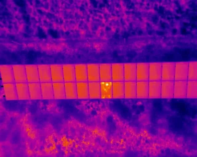
A single warm cell is the pattern most people recognise and the least specific one there is. A rounded, amorphous hot area centred on a point is consistent with an internal short-circuit path inside the cell. A linear, diagonal or star-shaped thermal trace across the same cell is consistent with a crack in the silicon that has severed a current path, leaving part of the cell dissipating power as heat instead of delivering it. Same cell, similar temperature, different mechanism, and a very different likelihood of getting worse.
When roughly a third of a module runs uniformly warm and the boundary of the warm area follows the substring rather than a cell edge, the bypass diode protecting that section is the candidate. It may be doing exactly its job, conducting because something is shading or obstructing the cells behind it, or it may have failed short and bypassed that substring permanently. The most reliable way to separate the two is persistence with no visible cause, which is why visible-light imagery is captured alongside the thermal and read with it rather than after it.
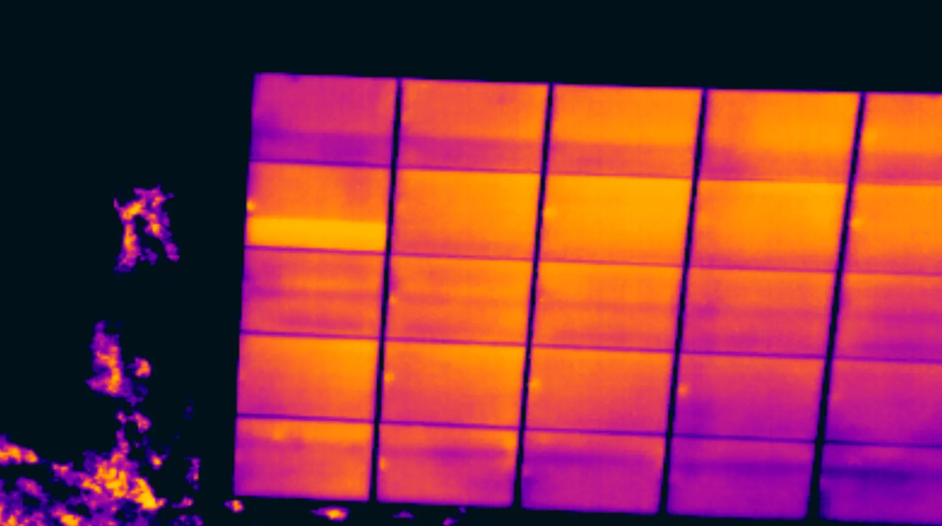
A whole module, or a whole string, sitting uniformly warmer than its neighbours usually points away from the cells altogether. Potential-induced degradation is the exception that gives itself away by geometry, appearing as a gradient with the cells nearest the earthed frame warmest and the centre of the module coolest.
The patterns that are not faults
Bird droppings, lichen, debris and partial shading all raise local cell temperature convincingly. Specular reflection produces bright artefacts that are not temperature at all. Modules with several junction boxes produce small, consistently positioned warm spots that are simply normal operation. Each of these is excluded before a classification is made, never after it.
Severity, Caution and the Limits of the Method
Why severity is framed, not asserted
Severity under IEC 62446-3:2017 is banded, and the band is set by the difference above the established baseline rather than by an absolute reading. That is deliberate, because the same defect presents with a different temperature difference on a different day, on a different module type, at a different viewing angle. Quoting one figure as though it settles the matter is the most common way a report claims more than the imagery can support.
Two disciplines keep the classification honest. Radiometric measurement carries a tolerance, so a value sitting close to a band boundary is classified conservatively and the proximity is recorded rather than quietly resolved. And the temperature difference sets the band while the pattern sets the fault type, so the two are always reported together and never collapsed into a single number.
The boundary of the discipline matters just as much. A thermographic survey identifies, classifies and evidences a condition at the time of inspection under the conditions recorded. It does not confirm a root cause, and its findings are areas warranting further investigation by a suitably qualified contractor. Survey, analysis and reporting is the whole of the service, and saying so plainly is part of what makes the report defensible.
Governing Standards and Competence
- IEC 62446-3:2017, outdoor infrared thermography of photovoltaic modules and plants in operation, the methodology this work is aligned to.
- IEC 62446-1, photovoltaic system documentation, commissioning and string-level electrical verification, referenced where thermal and electrical inspection are combined.
- Surveys conducted by Steve Fisher, ITC Level III Certified Master Thermographer (Infrared Training Centre; Certification #205722059).
- Practising in accordance with the frameworks of ISO 18436-7:2014, ASNT SNT-TC-1A and ANSI/ASNT CP-105, and BINDT CMGEN Appendix B as UK training governance.
- Survey, analysis and reporting only. Findings are areas warranting further investigation by a suitably qualified contractor.
Talk to a Level 3 Thermographer About Your Array
Drone Media Imaging carries out thermographic surveys of rooftop and ground-mount photovoltaic arrays aligned with IEC 62446-3:2017, with the analysis and the reporting done by the same certified thermographer who flew the site. Coverage across Sussex, Hampshire, Kent and Surrey, travelling throughout the UK, Ireland and Europe.
related posts
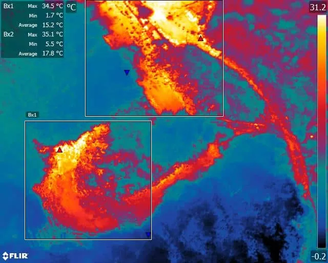
The use of drones equipped with thermal imaging cameras has revolutionized fire safety measures in solid waste landfill sites. These drones can detect temperature variations and hotspots, allowing operators to identify areas at risk of combustion and take proactive measures to prevent fires. Additionally, thermal imaging technology can detect thermal emissions and chemical and physical parameters, providing valuable data for monitoring and managing landfill sites. This technology has already shown promising results, reducing the number of fire incidents in landfill sites and minimizing environmental impact and health risks. As the technology continues to advance, drone environmental thermal imaging is expected to become an indispensable tool in solid waste landfill site management.

How close can a drone legally fly to people and buildings in the UK? This piece sets out the ground rules in plain terms: the Open category subcategories A1, A2 and A3, the 120 m height limit, the separation kept from uninvolved people and from residential, commercial, industrial and recreational areas, what "uninvolved" means for your own staff and visitors, and why a Specific category Operational Authorisation is what lets a commercial operator work closer on a busy site.

Plenty of commercial property sits close to an airport, and a Flight Restriction Zone reaches well beyond the perimeter fence. A site two miles from a runway, with no view of it, can still sit squarely inside the zone. This post explains what those zones cover, the three separate permissions that people tend to treat as one, why the airspace approval is assessed flight by flight rather than granted once, and what to tell your operator before the date is agreed.